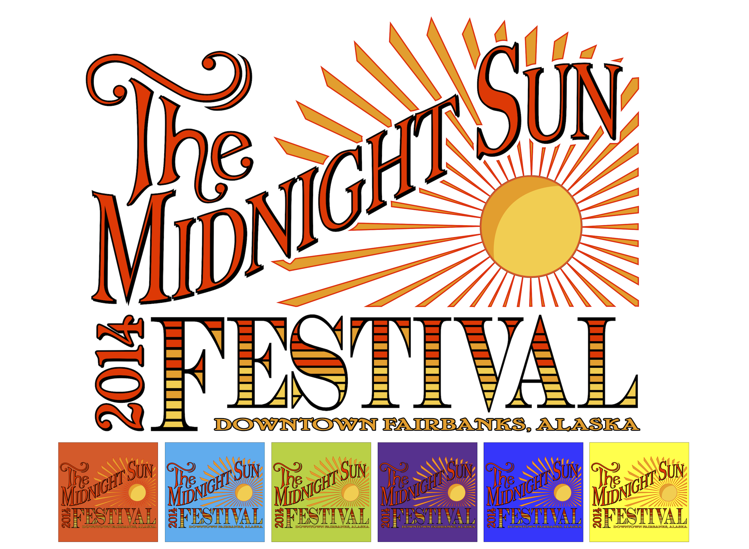
So I am finally getting around the writing this blog post that I promised a couple weeks ago. That’s what a flu-like illness will do to a person! After recovering from the horrible symptoms and waiting for my heart activity to come back to normal (yep, it was that bad), I was then free to… Catch up on school work! No blog posts for yet a while after recovering. I was behind in school work and now that I am caught up with that I feel it’s a good time to finally write about my experiences with designing the Midnight Sun Festival t-shirt and logo design.
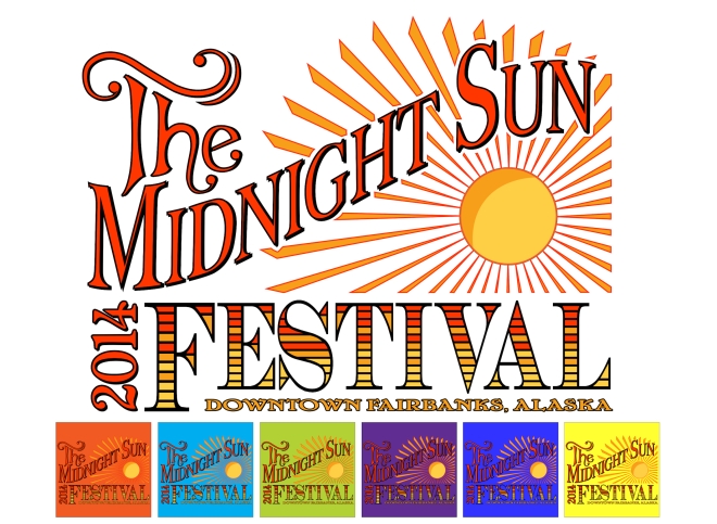
The instructions were to design a logo and then incorporate the logo into a t-shirt design, so that every entry consisted of two files. For some reason I decided to attempt to do the whole thing in Adobe Illustrator, which I have been trying to learn for the last couple of years in half-hearted attempts at designing various designs. This time I challenged myself to do the entire thing in Illustrator.
Now on a side note, I probably could have done this exact design in just a few hours using Adobe Photoshop, since I have been working with that program for 10+ years. But Illustrator has always struck me as an integral part of graphic design knowledge, thus my desire to use it and only it in designing the Midnight Sun Festival t-shirt and logo.
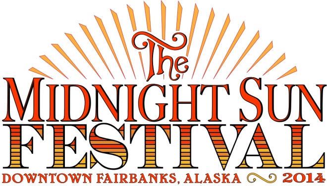
My very first problem was getting the swoop in the text “Midnight Sun.” I have to admit, I created the text in Photoshop but then traced over it with the pen tool in Illustrator. I just couldn’t figure out how to do that in Illustrator without sneaking in a little Photoshop into the process. This, however, gave me a great deal of practice with the pen tool, which I am able to use but am not proficient with.
And since I am a font-lover I settled on a condensed version of Big Caslon for this text. It fit my original idea for the text, which was to have accompanying accent lines just outside the lower and right hand surfaces of the text (which I ended up not using in favor of the thick drop-shadow type behind the main text).
I also used the pen tool to draw the “The” letters after sketching those out in my sketchbook. I decided to make “The” and “Midnight Sun” match so the next step was figuring out how to use swatches, what it really meant to lock a layer so I couldn’t alter it when I was manipulating other pieces of the design, and how to create outlines out of strokes so I could manipulate by hand the thicknesses on various parts of the strokes. This process probably took me two or three days alone, since at this point I was still very new to these new aspects of Illustrator (and because as a mother of three little ones it is darn near impossible to sit at the computer for hours at a time uninterrupted while working on a design!).
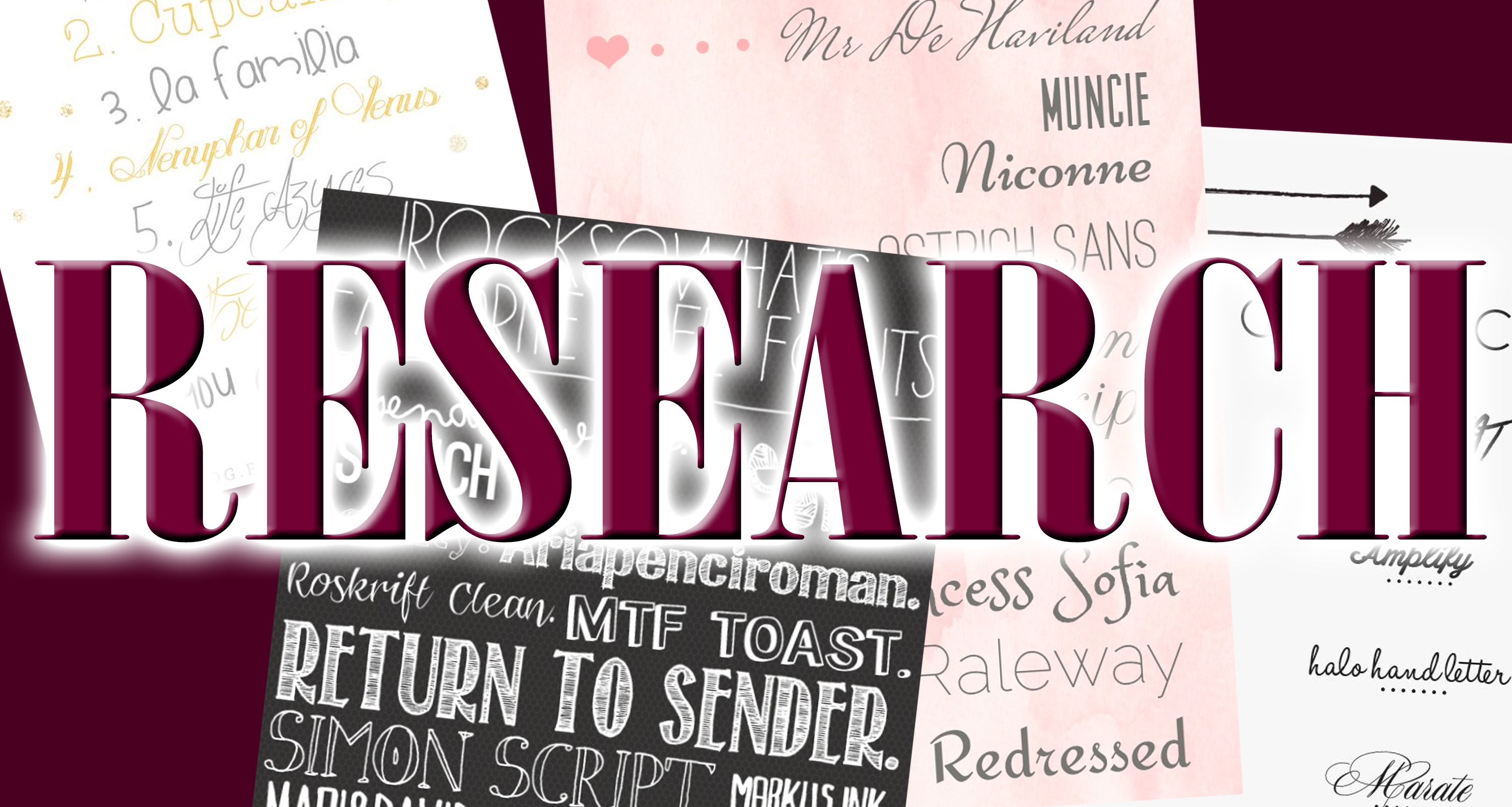
During this time I looked up so many different Illustrator tutorials I should have kept a list. Most of my new Illustrator knowledge came from these tutorials and not from me fiddling around with the controls. I think this was how I learned about locking the layers!
And the funny thing is, many of the things I learned were from the narrators of these video tutorials were actions they were doing from second-nature, such as locking layers, rather than them actually instructing me to do what the topic of the tutorial actually was. If that makes sense…
I altered a font to come up with the “Festival” and used my three selected colors to color it the way I did. And the font I used for the “2014” and “Downtown Fairbanks, Alaska” was Cheboygan, a font I found on www.dafont.com. It took a while to figure out where to place the “2014” but I managed to squeeze it in. My husband suggested I make it really big underneath the “Festival, Downtown Fairbanks, Alaska” but I declined. It made the “2014” appear like the focus of the design rather than the rest of the text.
The final part of the design was the sun, which took an additional two days to make in Illustrator and to color just the way I wanted it. During this time I found the amazing rotate tool, which enabled me to make a circular grid to perfectly line up the sunbeams. I will be utilizing this trick in the future, for sure!
After all of this week-long drama, the logo took me a day to design out of elements from the t-shirt design. I really liked what I came up with for the logo but in hindsight I probably should have incorporated more hand-drawn elements, and maybe more elements of downtown Fairbanks.
I now have a whole year to tweak this design and to come up with new ones. You will see me in next year’s contest! And look for my designs in any other local contests that might pop up. I know some designers may feel it is beneath them to enter local contests but I find these are excellent opportunities to flex my skills, learn new ones, and to earn a little name recognition in the local art community.
Thanks for reading, and have a great day!